
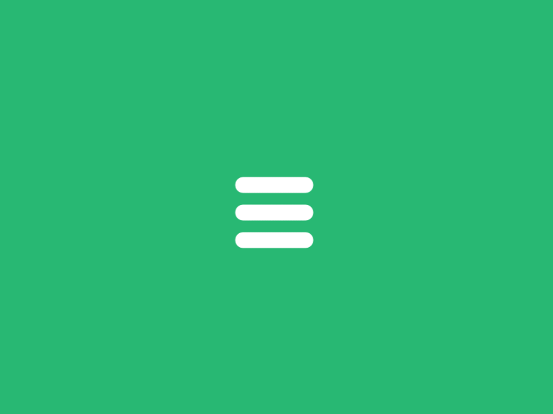
很高兴与你分享一个有趣的菜单图标效果。这个效果在默认状态下,图标是三条线,当你点击它,会出现一个有趣的动画效果并变成一个关闭图标。先来看一下效果预览:
我们将使用 SVG 和一个名为 Segment 的 JavaScript 库创建此效果。首先,我们将做一些初步的规划,然后我们将介绍 Segment ,稍后我们将绘制图标动画。
规划
为了达到这个效果,使用 SVG 是最好的选择,而 Segment 库提供了实现这种效果所需的功能。
主要实现原理是创建3个路径,将路径的运动轨迹转换为关闭图标。Segment 库允许我们按照我们的的想法创建路径动画。要绘制路径,可以使用任何矢量编辑器(如 Adobe Illustrator 或 Inkscape ),我们将手动绘制路径(绑定直线,曲线和弧度),因为我们希望获得最佳的准确性。请记住,我们正在做一个包含“弹性”运动的动画,因此必须要考虑这些动画在每个路径上的长度。但在我们继续之前,让我们来了解 Segment 。
Segment 介绍
Segment 是一个 JavaScript 库,主要用于绘制 SVG 路径动画。使用起来也非常简单:
<!-- Add the segment script (less than 2kb) -->
<script src="/dist/segment.min.js"></script>

<!-- Define a path somewhere -->
<svg>
    <path id="my-path" ...>
</svg>

<script>
    // Initialize a new Segment with the path
    var myPath = document.getElementById("my-path"),
        segment = new Segment(myPath);

    // Draw a segment of a stroke at the time you want
    // Syntax: .draw(begin, end[, duration, options])
    segment.draw("25%", "75% - 10", 1);

    /* Full example with all possible options */

    // Define a normalized easing function (t parameter will be in the range [0, 1])
    function cubicIn(t) {
        return t * t * t;
    }

    // Define a callback function
    function done() {
        alert("Done!");
    }

    // Draw the complete path
    segment.draw(0, "100%", 1, {delay: 1, easing: cubicIn, callback: done});
</script>
注意,Segment 不包括任何缓动函数(默认线性函数除外),所以我们还需使用优秀的 d3-ease 库。
绘制
这是一个非常快速的动画,但如果我们逐帧分析动画,我们可以绘制每个路径。结果是这样的:
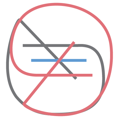
同时创建以下代码:
<svg width="100px" height="100px">
    <path d="M 30 40 L 70 40 C 90 40 90 75 60 85 A 40 40 0 0 1 20 20 L 80 80"></path>
    <path d="M 30 50 L 70 50"></path>
    <path d="M 70 60 L 30 60 C 10 60 10 20 40 15 A 40 38 0 1 1 20 80 L 80 20"></path>
</svg>
现在我们需要在路径中添加适当的 CSS 样式来实现所需的效果,并且可以从脚本中轻松访问它们。这是我们将要使用的 HTML 结构:
<!-- Wrapper -->
<div id="menu-icon-wrapper" class="menu-icon-wrapper">
    <!-- SVG element with paths -->
    <svg width="100px" height="100px">
        <path id="pathA" d="M 30 40 L 70 40 C 90 40 90 75 60 85 A 40 40 0 0 1 20 20 L 80 80"/>
        <path id="pathB" d="M 30 50 L 70 50"/>
        <path id="pathC" d="M 70 60 L 30 60 C 10 60 10 20 40 15 A 40 38 0 1 1 20 80 L 80 20"/>
    </svg>
    <!-- Trigger to perform the animations -->
    <button id="menu-icon-trigger" class="menu-icon-trigger"></button>
</div>
和 CSS 样式:
// The wrapper was defined with a fixed width and height
// Note, that the pointer-events property is set to 'none'.
// We don't need any pointer events in the entire element.
.menu-icon-wrapper{
    position: relative;
    display: inline-block;
    width: 34px;
    height: 34px;
    pointer-events: none;
    transition: 0.1s;
}

// To perform the scaled transform for the second demo
.menu-icon-wrapper.scaled{
    transform: scale(0.5);
}

// Adjusting the position of the SVG element
.menu-icon-wrapper svg{
    position: absolute;
    top: -33px;
    left: -33px;
}

// Defining the styles for the path elements
.menu-icon-wrapper svg path{
    stroke: #fff;
    stroke-width: 6px;
    stroke-linecap: round;
    fill: transparent;
}

// Setting the pointer-events property to 'auto',
// and allowing only events for the trigger element
.menu-icon-wrapper .menu-icon-trigger{
    position: relative;
    width: 100%;
    height: 100%;
    cursor: pointer;
    pointer-events: auto;
    background: none;
    border: none;
    margin: 0;
    padding: 0;
}
创建动画
制作好 SVG 后,我们现在的任务是找出或猜测每个动画部分中使用的缓动函数,并尽量实现和 GIF 动画的同步。让我们看看如何为菜单图标的顶部和底部的条形图设置动画。首先,我们需要为具有初始值和结束值的每个条形初始化 segment 。因为我们现在没有具体参考数值,只有 GIF 图。所以这是一个试错过程,直到找到正确的值。
var pathA = document.getElementById('pathA'),
    pathC = document.getElementById('pathC'),
    segmentA = new Segment(pathA, 8, 32),
    segmentC = new Segment(pathC, 8, 32);
为此,我们准备制作动画,在整个动画过程中始终保持相同的长度(结束 – 开始= 24)。分析动画序列,我们可以看到,第一部分以线性缓动函数开始,以弹性结束。我们将使用 Segment 的函数作为参数,以重复使用与顶部和底部栏相同的功能,因为它们将以相同的方式进行动画。
// Linear section, with a callback to the next
function inAC(s) { s.draw('80% - 24', '80%', 0.3, {delay: 0.1, callback: function(){ inAC2(s) }}); }

// Elastic section, using elastic-out easing function
function inAC2(s) { s.draw('100% - 54.5', '100% - 30.5', 0.6, {easing: ease.ease('elastic-out', 1, 0.3)}); }

// Running the animations
inAC(segmentA); // top bar
inAC(segmentC); // bottom bar
我们只需要重复同样的过程:
// Initialize
var pathB = document.getElementById('pathB'),
    segmentB = new Segment(pathB, 8, 32);

// Expand the bar a bit
function inB(s) { s.draw(8 - 6, 32 + 6, 0.1, {callback: function(){ inB2(s) }}); }

// Reduce with a bounce effect
function inB2(s) { s.draw(8 + 12, 32 - 12, 0.3, {easing: ease.ease('bounce-out', 1, 0.3)}); }

// Run the animation
inB(segmentB);
要将动画反转回菜单图标,我们将使用:
function outAC(s) { s.draw('90% - 24', '90%', 0.1, {easing: ease.ease('elastic-in', 1, 0.3), callback: function(){ outAC2(s) }}); }
function outAC2(s) { s.draw('20% - 24', '20%', 0.3, {callback: function(){ outAC3(s) }}); }
function outAC3(s) { s.draw(8, 32, 0.7, {easing: ease.ease('elastic-out', 1, 0.3)}); }

function outB(s) { s.draw(8, 32, 0.7, {delay: 0.1, easing: ease.ease('elastic-out', 2, 0.4)}); }

// Run the animations
outAC(segmentA);
outB(segmentB);
outAC(segmentC);
最后,通过点击事件执行各自的动画,我们可以这样做:
var trigger = document.getElementById('menu-icon-trigger'),
    toCloseIcon = true;

trigger.onclick = function() {
    if (toCloseIcon) {
        inAC(segmentA);
        inB(segmentB);
        inAC(segmentC);
    } else {
        outAC(segmentA);
        outB(segmentB);
        outAC(segmentC);
    }
    toCloseIcon = !toCloseIcon;
};
动画是完整的,但有一点问题。在所有浏览器中看起来并不完全相同。路径长度似乎略有不同,主要是在 Firefox 和 Chrome 之间存在一个很小的差异。如何解决?
解决方案很简单。我们可以简单地使我们的 SVG 更大,以便路径更长,然后调整大小或缩小到所需的尺寸。在这种情况下,我们将 SVG 绘图的大小调整为以前的10倍,因此我们使用以下代码:
<svg width="1000px" height="1000px">
<path id="pathA" d="M 300 400 L 700 400 C 900 400 900 750 600 850 A 400 400 0 0 1 200 200 L 800 800"></path>
<path id="pathB" d="M 300 500 L 700 500"></path>
<path id="pathC" d="M 700 600 L 300 600 C 100 600 100 200 400 150 A 400 380 0 1 1 200 800 L 800 200"></path>
</svg>
然后我们用CSS缩小到原来的尺寸:
.menu-icon-wrapper svg {
    transform: scale(0.1);
    transform-origin: 0 0;
}
注意:我们还需要增加 JavaScript 代码中的浮点值(乘以10),还必须调整 CSS 中的 stroke-width 属性。如果你不介意非常小的跨浏览器差异,那么你也可以坚持原来的大小,但这种解决方法可能会帮助您解决一些差异。
今天我们探讨了如何使用 Segment 库实现 SVG 弹性动画。这只是实现这种效果的方式之一。你也可以做一些创意的 SVG 动画:)
原文:https://tympanus.net/codrops/2015/11/12/animating-svg-menu-icon-segment/